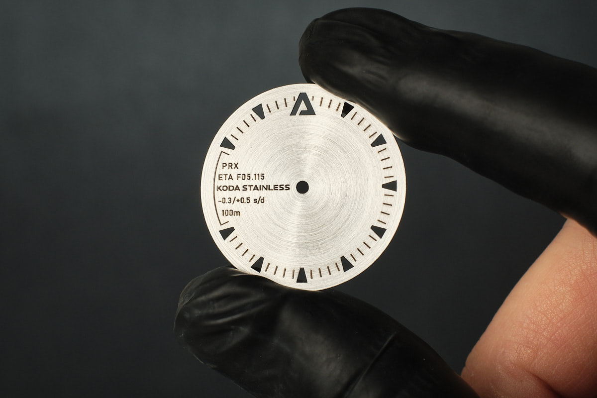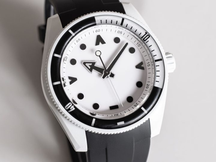
My first stainless steel dial is a nod to Micromilspec.
Someone showed me their Field Testing Unit design a couple of weeks ago and I just had to make something with the PRX 35 case. Figuring out the text kept me up at night and it all finally fell into place late Saturday night. The next morning I had that feeling – call it euphoria, obsession, jubilation, whatever, I was driven to see this through.
Perhaps not a traditional layout but I really like the simplicity and the balance. It’s the little things like the cut off triangle markers mimicking the shape of the text, the cool blue lume colour against the backdrop of steel, and the way the radial brushing picks up the top of the text and flows around all of the negative space and ends up back at the text.
I don’t often get carried away but I really like this one. Even before it was finished I knew I had something. I don’t expect everyone will like it, but I do and that’s important for me and my work. After handling so many watches getting excited about a watch design… it’s rejuvenating.
Comments (3)
-
That looks really good, nice and industrial and love the blue.
-
Yep, like it a lot!
-
Cheers 🙂
-

