I recently developed an interest in typefaces. It started with a book, Just My Type by Simon Garfield. It’s full of stories on the design of many typefaces and their designers. I hate to admit it but I now scroll through font sites browsing their offerings just for fun.
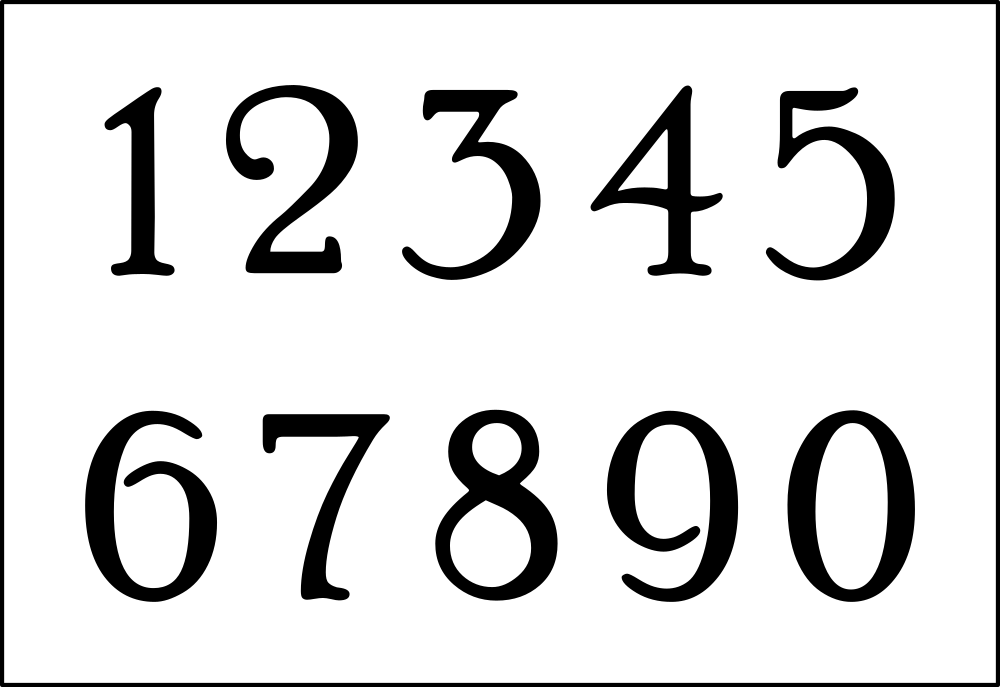
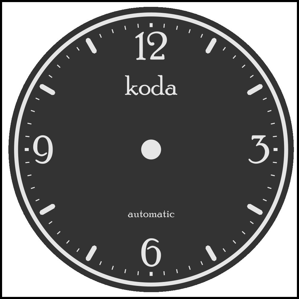
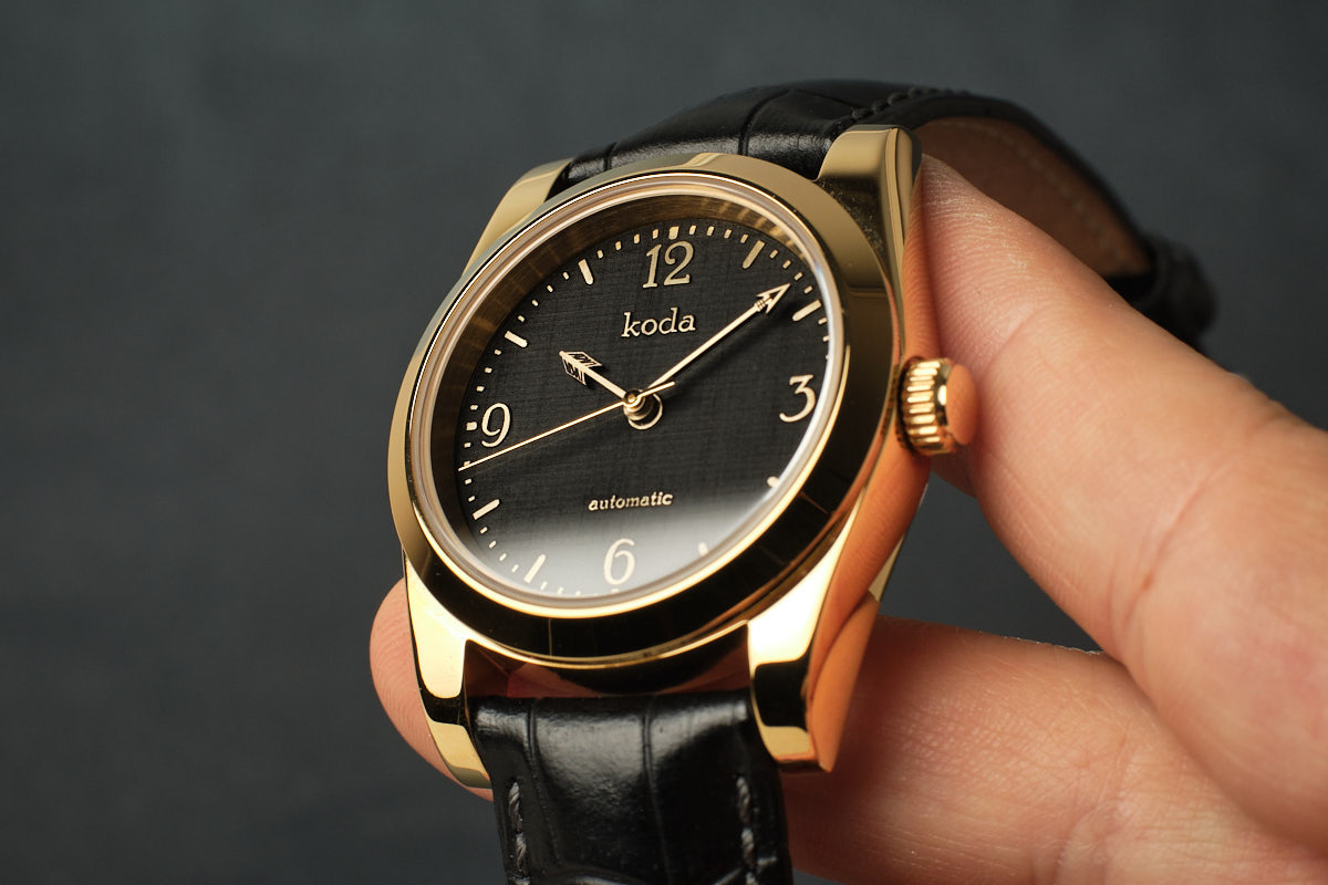
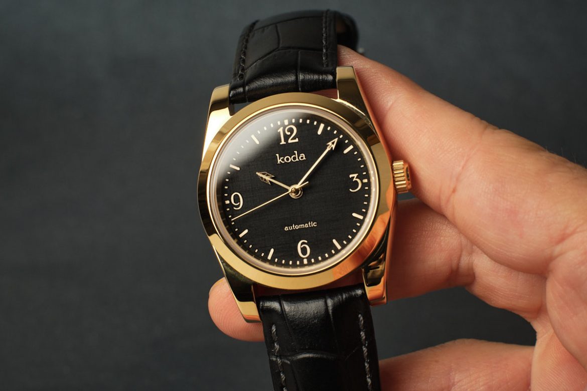
Archer started with a typeface called Poor Richard which is based on the Keystone Type Foundry design, circa 1919. A beautiful vintage typeface but an awful top heavy number 2. An Instagram follower commented, ‘the 2 looks like an obese duck’ when I posted one of the early drafts of this dial.
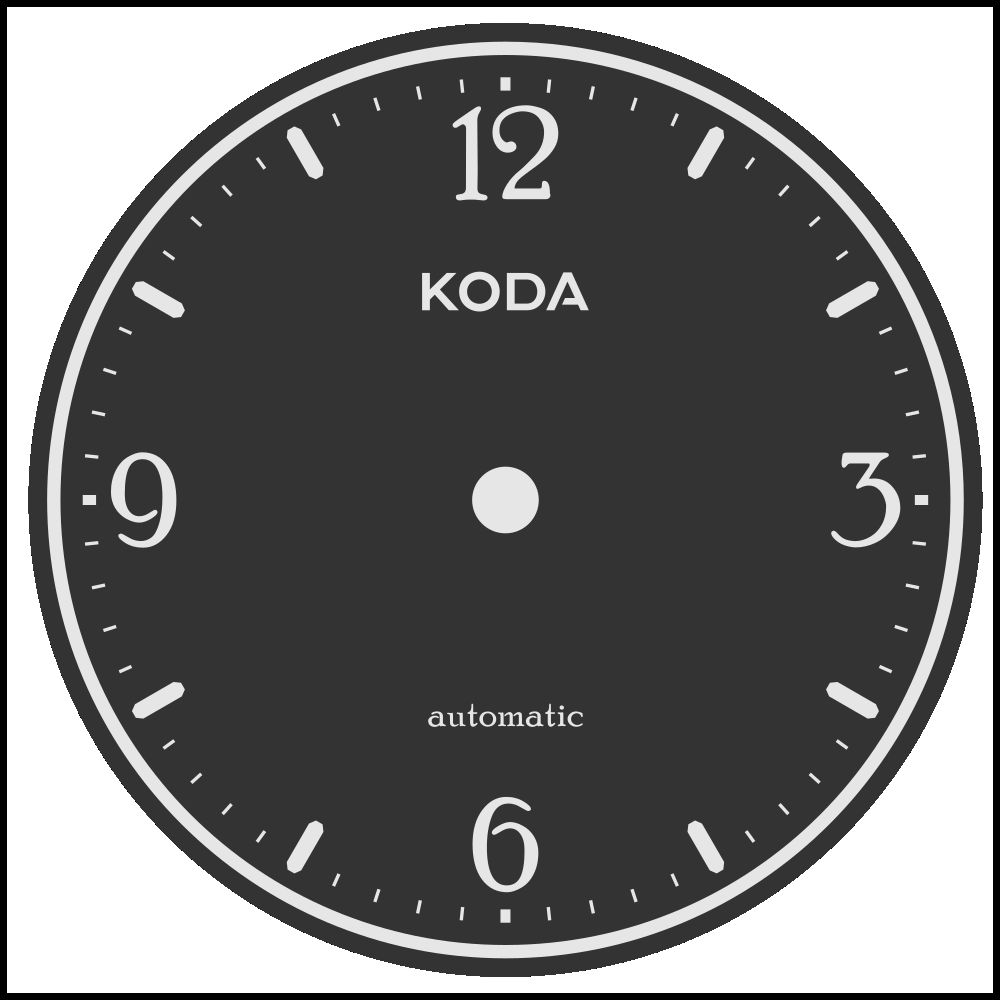
I extended the base of the 2 for the dial. I also used a lower case Koda in the same Poor Richard type but I shortened the ascenders. I went back and forth with this one. Changing my logo type felt like a brand compromise to but it also felt right to use Poor Richard for this build. Here are some earlier drafts of the dial showing the fat duck 2 and the standard height ascenders. The second shows my standard logo.
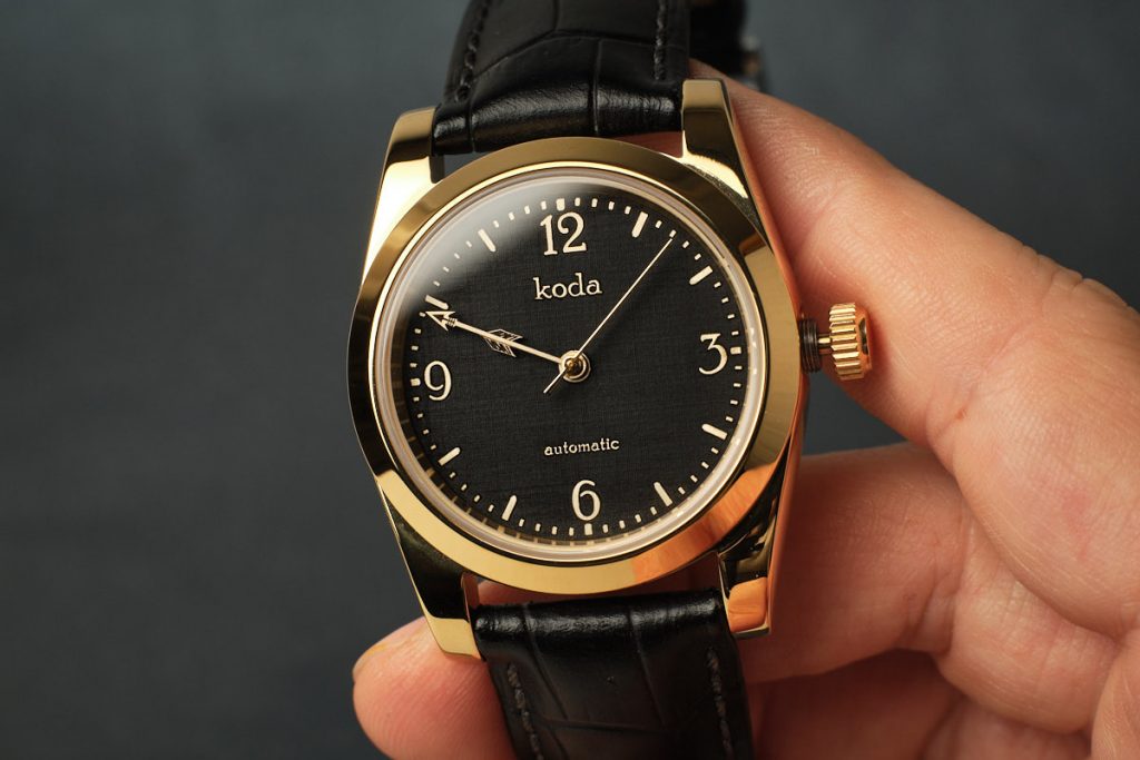
The dial was made from a piece of brass sheet and it’s my first one with this material. The laser left linen like marks on the material as it engraved its way around the indexes and text. The texture was a pleasant surprise as it really adds to the vintage feel. I look forward to making other dials out of brass. I’ve been admiring the lovely work by Sergey and Ron over the past few months and I’m glad I finally decided to try it.
I paused for a night as I considered what handset to use. Obvious choices included sets like the breguet style. I fell upon an idea to make a handset in the shape of rose thorns and when they overlapped it would look like one larger thorn. I was going to call it something along the lines of ‘A Dozen Thorns’ to allude to the fact that the hands cross and make 12 thorns with every full revolution of the hour hand. It didn’t feel right and early designs of the thorn hands looked unattractive.
After sleeping on it I came up with the arrow idea and hence the watch is called Archer. The minute hand is the front of an arrow and the feathers make the wider hour hand. On overlap the arrow is complete. I’m glad I gave the design some time to evolve.
My initial tests were just outlines. I spent some time on adding a little bit of depth to the arrow head and feathers. It’s a small detail but it made a big difference to the overall effect.
I selected a 36mm Oyster case as anything larger would not be in the spirit of vintage. A black alligator strap was a fitting choice. The movement is a Seiko NH35 and I have plans to make another smaller and slimmer version.
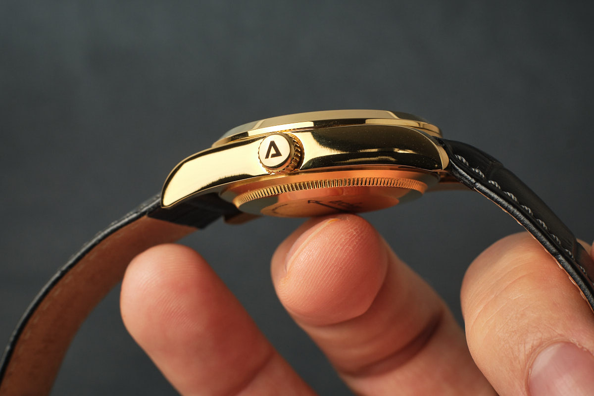
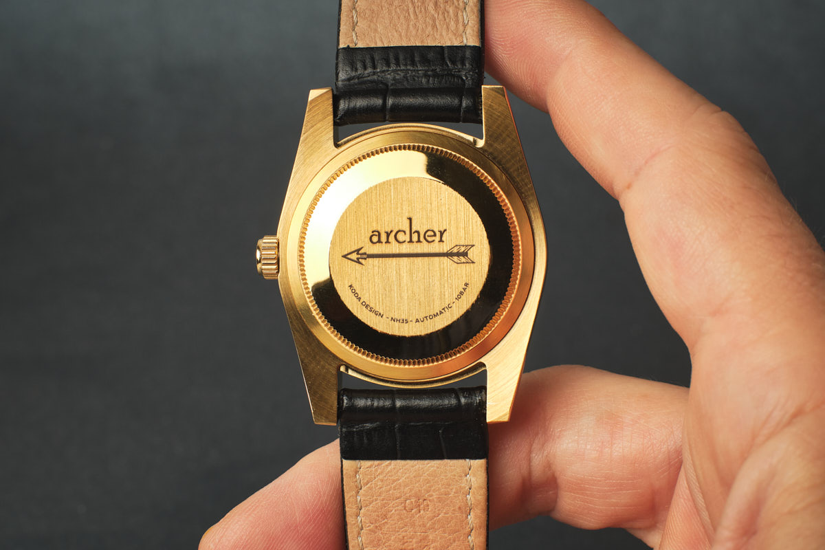
The crown is signed with my A and as always, the final touch is the caseback which features a simple nod to the overlapping hands and a few details of the watch.
Excuse me now while I go browse some font sites…

