
Yesterday was a public holiday here in Australia so I took the day off and… built a watch for myself 😜
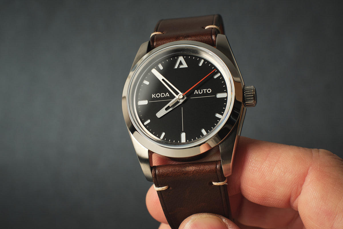

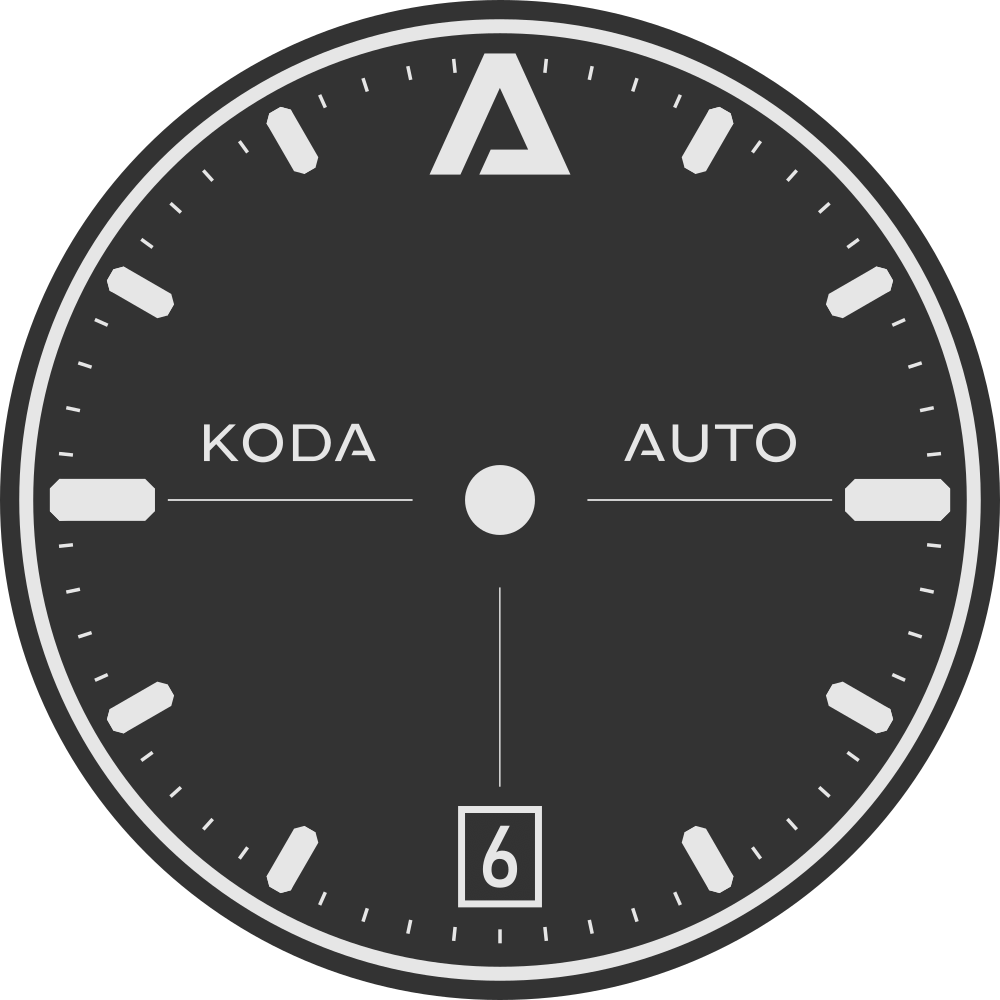
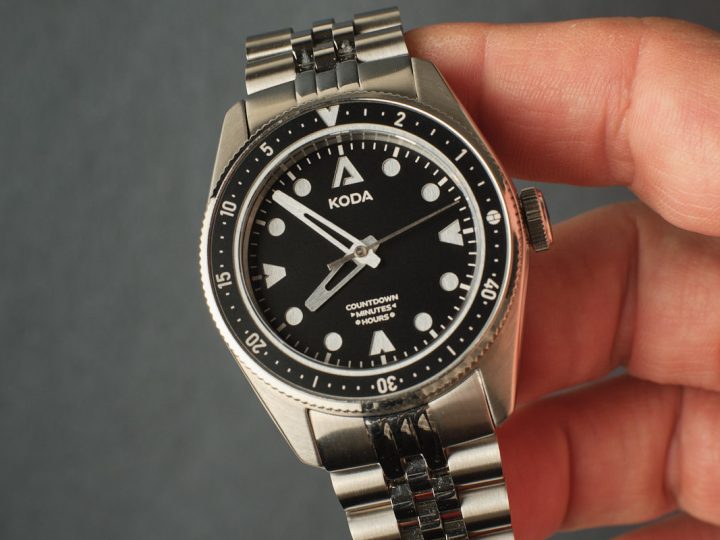
The Moto is my pursuit of legibility and balance in design. I’ve tweaked this one a few times and yesterday I had another go with minor changes, most notably the date at 6 with a deep set border that blends into the 6 marker. A date at 6 version was my very first concept and you can read a bit more about it here.
On the left is the original design with a date at 6 for an ETA 2824 movement and on the right is the current design for an NH35 movement.

I painted the dial top plate matte black for more contrast with the base and hands. The seconds hand was painted in the same finish leaving only the tip and centre untouched. Masking it was… interesting. I was trying to remove the distraction of the seconds hand by blending it in with the dial but at the same time make use of it with the tip floating over the minute track. It would have been easier to leave it off but if nothing else I enjoyed the challenge of masking it for painting.

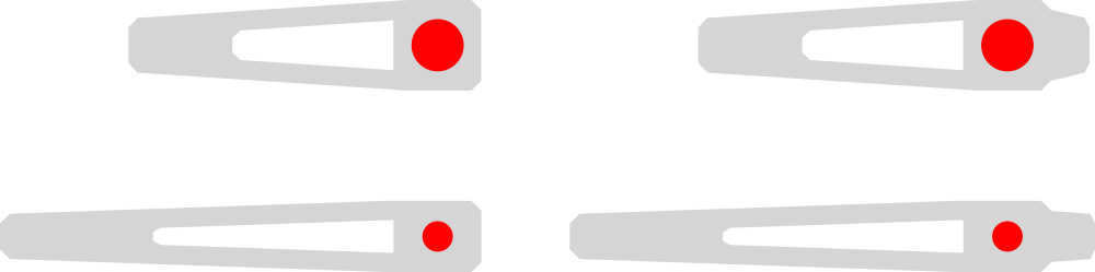
The hour and minute hands have gone through many variations as well and today I was testing a counterbalance. I wanted an interesting shape that ties in with the bevelled edges of the indices and at the same time I tried to make them distinguishable to aid with legibility. Lately I’ve been admiring the many different dauphine hands used by watch makers and these are my basic interpretation.
I’m not sure how else I could improve it, outside of raised indices, and I’m happy with the result but I’ve said that in the past and then done a deep dive into a new variation. I’ll wear it for a while and see how I feel. 🙂

Comments (2)
-
Hi George. I really enjoyed reading your thoughts on making the dial legible. The incredible finish you have achieved on the dial is this a laser film cut masked and painted. Love to know more on this process.
Legibility is something I have been working on in my own builds and usually opt for a striking contrast between hour and minute hands. On a sports model I love the quick glance to read time. Thank you for sharing. I have more dials then full builds. I love your end results. D
-
Author
Thanks Duncan. That is a laser cut plate painted black and glued to a silver reflective base plate – essentially a sandwich style dial. I’m a big fan of legibility as you know and this particular dial and hand combinaton is one of my better results in this regard, although not a popular one. Perhaps because it’s different and not a homage of something already popular. There’s a place for homages but I’m a bit fatigued by copies and love to try new designs.
I’d love to see some of your work, if you don’t mind sharing. 🙂
-